Thursday, 28 November 2024

Reflection

  This term I created a new website and new project 'Cycle of Life'. On the website, I really enjoy black design of my website.

I chose an images realated to black design and setup saturation to black and white.  The homepage image which I chose depict a skull   I thught this was well fitted to all concept.


The font I chose earlier ,had to be changed becouse I realise it was only for private use. So i changed it for another one. On the all website I used three different fonts,  major one , the second one for titles and describcions and last one for about me etc. I fitted all fonts to be visible and readable. On my portfolio webpage I added 4 various subpages "Cycle of Life" with my major project, "Previous works" depict my previous artworks, "Tattoo" depicts tattoo made by me and "Tattoo Stencil" depict tattoo stencils.


The "Cycle of Life" project had to be done on ipad pro in procreate but after many challanges ,my teatcher and I decide to change the project form from digital to hande using inkpens and watercolours. If I were to do digital project I would need more time to learn how to use procreate. Durning the creation of the paintings I had a few issues. I didn't add enough details with inkpens, additionally ,the colous i wanted didn't turn exactly as I imagined. Now after this experiance I know what I could do better.


For the "Cycle of Life" project I decided to depict myself at four important stages of my life. I used the colour red to marked myself and blue to marked my cousin. In the first painting, I drew my cousin and me as children. In the next one, I painted us when we have got around 26years durning the party. In the third one I wanted to show a complicated situation where I faced a difficult choice.This situation was very unclear and hard for me, but past everything and the pressure from many people, I chose to be with my cousin, even  most people believed in fake informations. In the final painting, I depict my cousin and me at around 70 years old grandpas ,this painting representing the future. It shows hard moments and life twists.


Wednesday, 27 November 2024

THE PROCESS ON PROCREATE: HAND PAINTING CYCLE OF LIFE

 After change digital to hand painting I started by planing my "Cycle of Life" project. I had a few ideas ,but after calculate everything I reduced number of images to four.  


Image below deict first plans.


Next I started draw a grid as a support on special watercolour paper ,for this task I used pencil and ruler.


I started measuring everything and drawing it using a pencil.


Then I used inkpen to draw second layer, first I used a smaller one and then bolder. 


When I did that, I took another piece of paper to start the next sketch. 


I did the same with the third drawing.


...and I did the same with the fourth one. 


When I had 4 drawings completed with Inkpen, I moved on to adding watercolor. 


I started by coloring the face using red ,and blue colours and then I add yellow etc.I agreed with the teacher to use one color palette and for everything to be "consistent". So I had to add colours for all paintings at the same time.


It didn't turn out as I imagined, I need to work more on blending watercolours. 


Slowly I had adding colour one by one. 


Once I finished I realised that I had to add more details using inkpens.


So I created bricks to fillup the page.


I tryied to add more details using inkpens to other paintings but it was too late for it.  Below I leave my final paintings.


Tuesday, 26 November 2024

Website: UX Testing & Feedback

I created a UX Testing and Feedback form that I added to my website so that I could test and get feedback before assessment.  I will go through the questions and responses here


Here, I got a mixed response to the Homepage design, most of answers are positive no one marked a negative answer, but I want to make some changes


Here most of the answer are excellent , so i think that the “navigation menu” is ok so I will leave it as it is.


Here most o the answers are excellent too but I also got “okay - links works okay with some issues” from one respondent so I will check it if everything works correctly.


Here I have a lot of comments about what I could improve and definitely I will make it real that’s mean I will change tattoo video for fine art work, I will check link to instagram, change the text font for better readable.


The about page looks good on average, but there was people who marked 3 stars of 5, so I will take a look again on it and I will think about what I could improve.


Few people respond that I should look again at the text and manipulate it because last world is unvisible.


Most of responses are good ,some are excellent and one is okay, this part of webpage is unifinished. I will finish it in nearly future.


Yes, that is true, the font need to be changed and I have to add my final outcome.


Half of responses answer 4 stars ,three of the people marked 5 and 2 of them marked 3 stars, Average rating is around 4 its good but i know the responders are my friends and its not really objective, I think true rating should be around 3 or low, but I got comments and I know what I have to improve to have better website.


Yes contact page and the video will be changed , I will work on text too.
 Thank You everyone for responses, now I know where i made a mistakes and what I have to change.  That was good lesson for me.


Sunday, 24 November 2024

THE PROCESS ON PROCREATE: DIGITAL PAINTING CYCLE OF LIFE

“Cycle of Life” project.

 In that post I will show how I created my two of six digital painting using Procreate on iPad Pro.  


I started from drawing a skull. For this task I used reference an image. I opened reference image and began drawing skull next to it.  First I maked quick sketch and then I draw on new layer a main artwork.


Next I saved an image, then i opened it as a new layer added colour and adjust size of the object. Why I have chosen a skull as a first drawing? The skull is related to my project “Cycle of Life” I thought i might be need it in few artworks. It. Also good as warm-up exercise. I don’t have a lot of experiences in this type of task.


Then I moved on to drawing first main image, which was. “A newborn” I used reference image for it as well and grid as a support to catch proportions well. It’s not complicated image but for me it was a challenge to create it. First problem was to chose a good brush for this task. In this image I used default brushes included to Procreate but after I downloaded and tested a lot of free brushes and the new ones “do the job” I would like to test more new brushes and experiment with it. I will do it in nearly future.


Here I added a colours and skull. I know its looks simple and not like other students works, but im learning and i feel i doing progress ,step by step.  I moving forward.


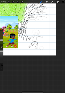
After I moved on to the second image which will depict “the childhood “ The main idea was to draw kids durning play football and add some symbol like tree half with life’s as. A symbol of growing and life and half without leafs as a symbol of death ,end etc. I started by creating a simple lines.


Then I moved on to draw a kids. For this task I used a grid as a support and  first i draw the quick sketch and then i opened a new layer to redraw it as before. I used a reference image for this.


Here is finished a drawing of a kid, I manipulate size to adjust it to whole image. I tested a few sizes of an image and I chose the best one when I thinks is looks well.


Then I added colours and the background to it but few days later i downloaded new brushes and I draw the background used new ones. The final effect of my two digital artwork is below. I know its might looks simple but next one will better.


Thursday, 21 November 2024

Creating a Website: Gallery/Portfolio Page

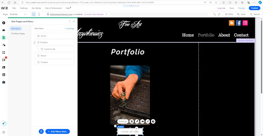
 I have created my gallery/portfolio page. It’s ready and waiting for my “Cycle of Life” project.  I started from opening a Wix and then i added ,a photo which representing my project. I clicked “Add” in tools menu and next i clicked “image” and “upload image”.  Next I manipulate that picture to set up it perfectly where I want. Next i come back to “add” in tools menu and then “button” next I chose a button and I put it on to the page.  After I back to the “menu” and I created new page with my project name. Next I establish it on my portfolio, I clicked to dialog box and then “subpage”. 


Next I went back to the portfolio page and then I setup connection between button and my page. 


I saved and previewed this to check that the button worked and appeared in the submenu. Next added gallery template to my project “subpage”.


Next I created button “back to gallery” same story as before” I went back to “add” in tools menu and then “button” next I chose a button and I put it on to the page” and also I connected it to Gallery/Portfolio page


Next I turned off “show on All Pages” option.


When I finished I saved it and previewed this I check a mobile view.


Then I adjust size of button to appear correctly.


Tuesday, 19 November 2024

Blog Project Plan Update/Website Evaluation

 Today, I am just looking at my project plan and looking at what I have completed so far and what still needs to be done


  • Project Sign Off Post completed

  • Initial Research post Gustav Klimt The Cycle of Life

  • Project Plan - Completed on Visme

  • At least three research posts on other artists Edvard Munch, Nathaniel Currier

  • Development and research post

  • A post on your target market Software Practice/Customer Profile

  • at least two process posts 

  • Technical research post on software you will use Software practice: Making digital portrait with Procreate

  • Post on creating your portfolio gallery

  • Finalising your portfolio and adding to your website


Planning stage:

  • What were your initial ideas for creating a website? style / name / template
I chose a art template that i though it will be fit to my art webpage. I chose my artwork image as a background of the home page
  • Do you have a tagline on your website?

I added a Leonardo Da Vinci Quotation “Painting is poetry that is seen rather than felt, and poetry is painting that is felt rather than seen.” I believe this quote will stop the website visitor for a moment for reflection.


Research:

  • Which designers / artists (relevant to your continuation route) websites did you look for inspiration?

I completed website evaluation of Alex Grey and Tadanori Yokoo. This gives me ideas how supposed to looks my website. I want to create a webpage like  Alex Grey. Tandori showed my how page shouldn't looks like.
  • How many pages did you want to make on your website and why? Did that change as you progressed onto the research / designing stage?

I created Home , Contact and About page. Portfolio would be create in short future. 

Content:

  • What is the purpose of your website?

I would like to reach to as many people as possible. Currently, this website is not commercial, but it maybe change. I could add a calendar that would allow users to check available dates or book a session. 
  • Who are your potential website users?

My potential website users will be people around 18-40 years old 
  • Why do you think it is important to have a digital portfolio website?

Most potential clients have access to the internet and they are active online. Every year the number of internet users are increasing ,and it’s so important to develop social media as webpages etc.


Design:

  • Which design elements / tools did you use? (e.g.: infographics, fixed header, static background image, navigation menu design, text boxes, image galleries, social media feed) and why?


    On the homepage, I used my artwork, which I plan to change in the near future. It will be a gallery of a few pieces or tattoos I have done. I added the text to the ‘About’ page, the contact page, and the homepage. I set up the navigation bar to make it easier to use. I added copyright at the bottom of each page.


  • Which template did you use in Wix and why?

    As I said before I used art template.

  • How many pages does your website have and why?

    Four as stated above


Navigation:

  • Does your website have working social media icon links?

    Yes, there are three links to social media and they are at the top of each page. They are Blogger , Facebook and instagram. I have checked in the preview that these links are working. 


  • Are your pages connected / interlinked?

    Yes ,they are.

  • Is it easy to navigate?

    Yes. It is.

  • Does the “Contact” page / email link work?

I will check it later. 

Testing (this will be completed in week nine):

  • UX (user experience) testing – get your partner to view your website on their mobile or other digital platform.

  • Ask your blog buddy for feedback on your blog.

  • If your website is not working on a mobile platform, you will need to go back to the Wix Editor and check that you have enabled the mobile view.


Monday, 18 November 2024

Further Research: Cy Twombly

 In this research post, I will discussing the work of Cy Twombly and his abstract painting, I will also compare it to my understanding of how artworks should really looks likeFirst painting I would like to discuss is Untitled (Bacchus). In my opinion his drawing looks like childish scribblings. The technique that he used seems simple. All his painting looks unfinished. His artworks seem without sense just simple lines and shapes. Composition is chaotic. I don't feel Twombly paintings, its very difficult to understand what his painting depict. I'm not the only one who thinks his art is bad, Kozloff thought similarly.  Max Kozloff, saying, “Without an inherent tone of struggle, or pretense of evoking the unconscious, his calligraphy assumes that it was nothing other than what it was.” (ARTDEX ,2023)


Cy Twombly 1928-2011 Untitled (Bacchus) 2008


This painting is painted by Twombly which is related to Roman god of winemaking. As Christie states "In 2003, shortly after the US invasion of Iraq, the then 75-year-old Twombly embarked upon what became known as his Bacchus paintings, named for the Roman god of winemaking, fertility, madness and religious ecstasy."  If I have to say true I would say, my 9 year goddaughter  can do better than that. There is no skill here. 


The second artwork I will discuss is  Cy Twombly: Roman Notes (1970)

Cy Twombly: Roman Notes (1970) 


as Roland Barthes states Twombly’s work “does not derive from a concept (mark) but from an activity (marking). . . .” adding that the viewer sees “the hand’s becoming. . . . With each stroke [Twombly] blows up the museum.” Barthes emphasise that Twombly are focused on process ,not on effect. These “notes” seems simplistic  and like a created by child.  

This only confirms me in my opinion about Cv Twombly and there is nothing artistic, if I have to call everything that is made by human that is a work of art, every word written by me in my notebook could be an art for a few million. But I will see what others have to say about him. I will look deeper. Next critic I found is. Kenneth Baker.

Kenneth Baker, writing in 1972, “A Twombly is only a blackboard insofar as it is a painting, but its claim to being a painting, that is to a certain kind of meaning, is based on the illusion it gives of being a marked-up piece of slate. (Pincus-Witten 2024) 

Baker agree here with my  opinion  that Twomblys art is just piece of slate.For me nothing more needs to be added.


Reference:


 ARTDEX. In Contemplation of Lines and Scribbles – Cy Twombly’s Beautiful Writing – ARTDEX. 21 Sept. 2022, www.artdex.com/in-contemplation-of-lines-and-scribbles-cy-twomblys-beautiful-writing/. Accessed 18 Nov. 2024.

   Christie's. “Cy Twombly’s Untitled (2005).” Christies.com, Christie’s, 2017, www.christies.com/en/stories/twombly-circle-of-fire-4ea361fc138c4d319a3b193878e8eae8. Accessed 18 Nov. 2024.


 hazlittblog.wordpress.com. “The Hand’s Becoming: Recent Art Criticism and Cy Twombly.” Universal Hubbub, 8 June 2018, hazlittblog.wordpress.com/2018/06/08/the-hands-becoming-recent-art-criticism-and-cy-twombly/. Accessed 18 Nov. 2024.


 Pincus-Witten, Robert. “CY TWOMBLY.” Artforum, 1 Apr. 1974, www.artforum.com/features/cy-twombly-2-209788/. Accessed 18 Nov. 2024.

Art Portfolio 2 - Final Reflection

 Looking back in this term ,some things went better than others. When the art portfolio 1 was started I learnt how to make canvas, that I ha...